Comic Transcript
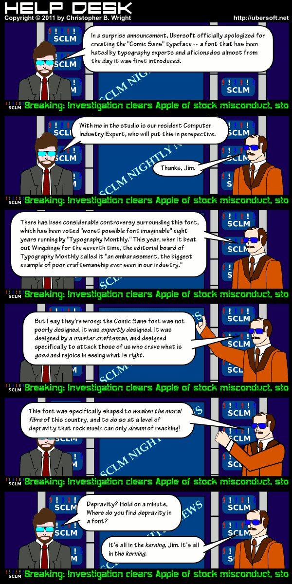
JIM WASHINGTON: In a surprise announcement, Ubersoft officially apologized for creating the “Comic Sans” typeface — a font that has been hated by typography experts and aficionados almost from the day it was first introduced.
JIM WASHINGTON: With me in the studio is our resident Computer Industry Expert, who will put this in perspective.
COMPUTER INDUSTRY EXPERT: Thanks, Jim.
COMPUTER INDUSTRY EXPERT: There has been considerable controversy surrounding this font, which as been voted “worst possible font imaginable” eight years running by “Typography Monthly.” This year, when it beat out Wingdings for the seventh time, the editorial board of Typography Monthly called it “an embarrassment, the biggest example of poor craftsmanship ever seen in our industry.”
COMPUTER INDUSTRY EXPERT: But I say they’re wrong: the Comic Sans font was not poorly designed, it was expertly designed. it was designed by a master craftsman, and designed specifically to attack those of us who crave what is good and rejoice in seeing what is right.
COMPUTER INDUSTRY EXPERT: This font was specifically shaped to weaken the moral fibre of this country, and to do so at a level of depravity that rock music can only dream of reaching!
JIM WASHINGTON: Depravity? Hold on a minute, where you do you find depravity in a font?
COMPUTER INDUSTRY EXPERT: It’s all in the kerning, Jim. it’s all in the kerning.